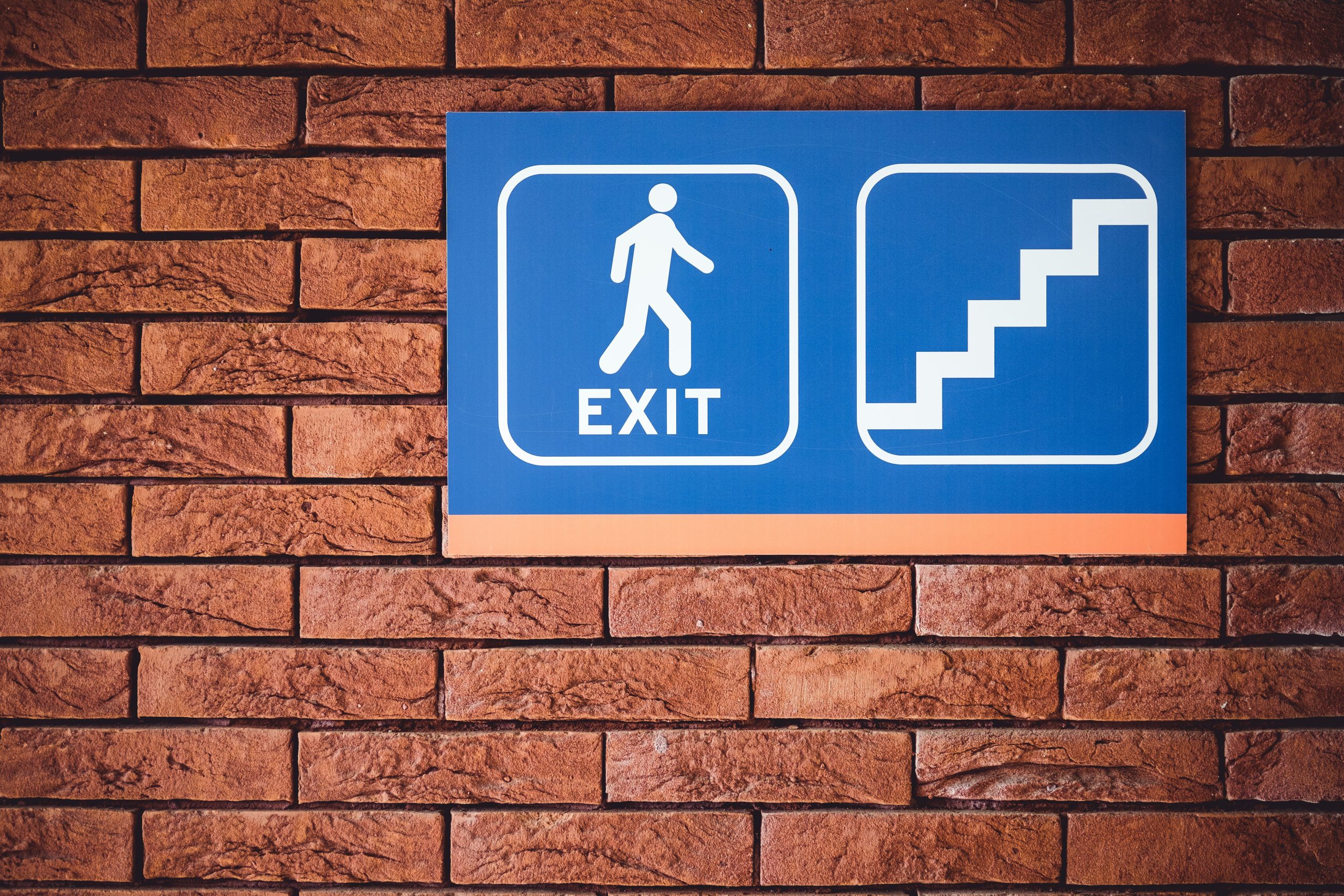
Designing a user-friendly indoor wayfinding system is crucial for enhancing the experience of individuals navigating through complex buildings such as hospitals, shopping malls, airports, and corporate offices. A well-designed wayfinding system not only reduces stress and frustration but also increases efficiency and accessibility. Here are some essential steps and considerations for creating an effective indoor wayfinding system.

Understand the Users and Their Needs
The first step in designing a user-friendly wayfinding system is to understand the users and their specific needs. Different users may have varying levels of familiarity with the environment, spatial awareness, and mobility challenges. Conducting user research through surveys, interviews, and observational studies can provide valuable insights into the needs and preferences of different user groups. First-time visitors, for instance, are unfamiliar with the environment and require clear, intuitive directions. Regular visitors may know the general layout but still need guidance for specific destinations. Additionally, the system must be accessible to individuals with visual, auditory, or mobility impairments. Non-native speakers also need to be considered, and multilingual signage and symbols can assist users who may not understand the primary language.
Conduct a Site Analysis
A comprehensive site analysis is essential to identify key areas that require wayfinding solutions. This involves mapping out the space, creating detailed floor plans, and identifying major entry points, exits, and key destinations. It’s important to pinpoint areas where users need to make decisions, such as intersections, elevators, and staircases. Assessing sightlines ensures clear visibility of signs and landmarks from various points within the space. Moreover, evaluating existing signage helps analyze its effectiveness and identify areas for improvement. By understanding the site thoroughly, you can create a wayfinding system that is both logical and intuitive.
Develop a Clear Signage Strategy
An effective signage strategy is the backbone of any wayfinding system. Consistency is key; using consistent colors, fonts, and symbols throughout the signage creates a cohesive and recognizable system. Establishing a clear hierarchy of information is also important, with primary signs guiding users to major destinations and secondary signs providing additional details. Legibility is another crucial factor—ensure that text on signs is large enough to be read from a distance and that there is sufficient contrast between text and background. Simplicity should not be overlooked; avoid clutter and unnecessary information by using straightforward language and universally recognized symbols. Placement is equally important—position signs at eye level and at key decision points to maximize visibility and impact.
Incorporate Technology
Integrating technology into your wayfinding system can enhance the user experience and provide real-time assistance. Digital signage, such as interactive kiosks and digital displays, can provide dynamic directions, updates, and information tailored to the user’s location. Developing a wayfinding app that users can download on their smartphones offers turn-by-turn navigation, augmented reality (AR) overlays, and additional information about the environment. Installing Bluetooth beacons and sensors throughout the space enables precise indoor positioning and navigation. These devices can communicate with users’ smartphones to provide location-based guidance, making navigation more seamless.
Use Landmarks and Visual Cues
Incorporating landmarks and visual cues into your wayfinding system can help users orient themselves and navigate more easily. Highlighting unique architectural features or design elements can serve as landmarks. Using different colors to designate specific areas or routes makes it easier for users to follow directions. Additionally, incorporating murals, sculptures, or other visual elements can act as reference points, making the environment more navigable and visually engaging.

Test and Iterate
Once your wayfinding system is designed, it’s crucial to test it with real users and gather feedback. Conduct usability testing with a diverse group of participants, including first-time visitors, regular users, and individuals with disabilities. Observing how users interact with the system helps identify pain points and collect feedback on the clarity and effectiveness of the signage. Based on this feedback, make necessary adjustments and improvements. Wayfinding systems are not static; they should be continuously evaluated and updated to address any issues and adapt to changes in the environment.
Provide Training and Support
Ensure that staff members are trained to assist users with wayfinding. Creating informative materials such as maps, brochures, and guides that users can take with them is also beneficial. Additionally, consider setting up information desks or help points where users can seek assistance if needed. Providing these resources ensures that users have multiple ways to get the help they need.
Conclusion
Designing a user-friendly indoor wayfinding system requires a thorough understanding of user needs, a clear signage strategy, the incorporation of technology, and continuous testing and iteration. By following these steps and considering the unique characteristics of your environment, you can create a wayfinding system that enhances user experience, reduces stress, and improves overall efficiency. Remember, a successful wayfinding system is one that guides users seamlessly to their destination, making their journey as smooth and intuitive as possible.
