
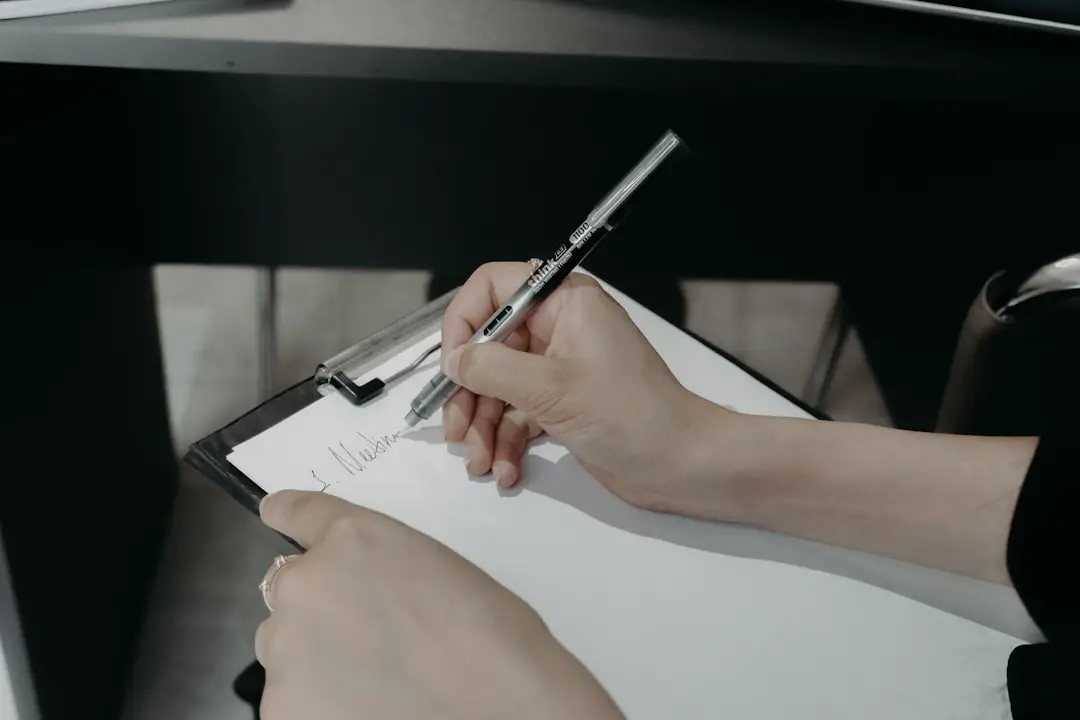
Sketching ideas onto paper is still one of the most popular ways to brainstorm designs, especially for logos. There’s something remarkably intuitive about picking up a pencil and letting ideas flow freely. But what happens after you’ve created that perfect sketch? Turning your hand-drawn logo into a clean, digital version might seem intimidating at first, but with the right steps and tools, it can be a fun and rewarding process.
TLDR (Too long, didn’t read):
Transforming a sketch into a digital logo involves scanning or photographing your design, using vector software to trace and refine it, and polishing your creation into a professional-grade file. Focus on clarity, proportion, and scalability. Clean lines and simplified forms help deliver a strong and versatile logo. Tools like Adobe Illustrator, Procreate, or free software like Inkscape can make this task easier and more precise.
Step 1: Start With a High-Quality Sketch
Before diving into digitization, make sure your original sketch is as clear and complete as possible. Even though you can refine details later, a high-quality sketch will save you time and headaches during the design process.
- Use sharp pencils or fine liners to ensure clean lines.
- Work on white, untextured paper to avoid unwanted shadows or noise.
- Keep the design simple and scalable — Logos should work at both small and large sizes.
Avoid smudging or adding unnecessary shading unless it’s an intentional part of the design.
Step 2: Scan or Photograph Your Sketch
The next step is to bring your hand-drawn design into the digital realm. You can do this by scanning the sketch or taking a photo of it. Ideally, a scanner provides better quality and consistency, but a high-resolution smartphone camera can work in a pinch.
When photographing:
- Ensure good lighting – natural light usually works best.
- Hold your camera directly above the sketch to avoid distortion.
- Use editing apps to increase contrast and clarity without overexposing details.
Step 3: Import Your Image into Vector Software
Once you have your image on your device, it’s time to open it using software like:
- Adobe Illustrator (industry standard, feature-rich)
- Inkscape (open-source and free)
- CorelDRAW (great for professionals with a different interface)
- Procreate with Photoshop (for those who love tablets and hand-drawn refinement)
Place the sketch on a separate layer and lock that layer. You’ll be using it as a guide while tracing your logo on a new layer.
Step 4: Trace Your Sketch
This is where the magic begins. Tracing your image means converting your raster scan (pixels) into vector graphics (shapes and paths) that can be scaled infinitely without losing quality.
You can trace in two ways:
Manual Tracing
This is the preferred method for accuracy and control. Use the Pen Tool or Bezier Tool in your software of choice to draw over your lines. It’s time-consuming at first, but it ensures that the final result is sharp and clean. You can also simplify curves and anchor points as needed to enhance readability and usability.
Automatic Tracing
Many programs offer automatic tracing functions (like Live Trace in Illustrator). While they offer a quick solution, they often produce unnecessary anchor points and may require a lot of cleanup. They’re best used for simple logos or to get a temporary outline to refine manually.
Step 5: Clean Up the Vector
After tracing, examine the vector paths. You’ll likely need to tweak curves, smooth out awkward corners, and consolidate overlapping shape areas.
- Simplify the design: Logos work best when they’re easy to recognize.
- Remove stray points or unnecessary lines for a smoother finish.
- Apply geometric accuracy where useful — straight lines, perfect circles, and balanced symmetry improve professionalism.
Use your software’s path simplification or “smooth” function cautiously; these tools can help reduce anchor points, but may also distort your intended design if overused.
Step 6: Add Typography (If Needed)
If your logo includes a name or tagline, now is the time to integrate typography. Choose fonts that match your brand personality — modern, classic, playful, or tech-savvy. A good rule of thumb is to limit yourself to one or two complementary fonts to maintain cohesion.
Pro tips:
- Don’t warp or stretch fonts for style — choose a font that fits naturally.
- Pay attention to kerning and spacing to keep things legible and balanced.
- If your logo is custom-lettered, consider turning the letters into vectors, too.
Step 7: Choose the Right Colors
While many logos start in black and white to emphasize shape and form, eventually you’ll need to select a color palette. Stick to two or three main colors, making sure they contrast well and evoke the right brand emotions.
Color psychology plays a role here:
- Blue: Trust, security
- Red: Passion, excitement
- Green: Growth, nature
- Black: Sophistication, authority
Test your logo against light and dark backgrounds to ensure versatility. Also, create a grayscale or monochrome version for flexibility across different use cases.
Step 8: Export and Save in Multiple Formats
Once your logo is polished and approved, it’s time to export it in a variety of formats to cover all use scenarios.
- SVG and EPS: Scalable vector formats — ideal for printing, websites, and future editing.
- PNG: Transparent background version — great for web use.
- JPEG: For quick file sharing and previews.
- PDF: For document inclusion or client presentations.
Organize your files clearly. A professional logo package generally includes:
- Full-color version
- Black and white version
- Icon-only version
- Horizontal and vertical layouts
Bonus Step: Get Feedback
Before locking in the final design, share your digital logo with trusted peers, mentors, or potential users. Sometimes, a fresh perspective reveals improvements you might miss after hours of zooming in on tiny anchor points.
Ask for feedback regarding:
- Legibility at different sizes
- Visual balance and proportion
- Emotional impression or brand personality resonance
Conclusion
Turning a hand-drawn sketch into a clean, professional logo is a process that blends artistry with technical precision. With the help of modern design tools and a little patience, that idea scribbled on a napkin can become a timeless symbol of identity.
Whether you’re designing for a client or for your own brand, staying attentive to detail and keeping your logo versatile is key. Embrace the process, and remember: Every iconic logo started as a simple sketch.