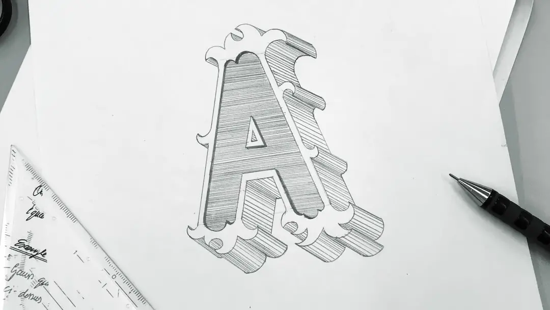
Designing a logo often starts with the spark of creativity — a simple hand-drawn sketch on paper. Whether you’re a small business owner, a freelance designer, or an artist bringing a concept to life, turning that rough idea into a professional, flexible logo requires a strategic process. A well-crafted logo is more than just aesthetics; it is a visual representation of a brand’s identity, values, and mission.
TL;DR (Too Long; Didn’t Read): Turning a hand-drawn sketch into a clean, digital logo involves scanning or photographing the sketch, refining it digitally using vector-based software, and ensuring it meets professional design standards like scalability and color consistency. Tools like Adobe Illustrator or alternative vector software allow you to trace and polish the design meticulously. The final output should be flexible, clean, and formatted in multiple file types for various use cases. Attention to font selection, alignment, and consistency are key to transforming a rough sketch into a powerful branding asset.
1. Start With a Strong Sketch
Every great logo starts with a clear concept. Your hand-drawn sketch should embody your brand’s message and values. Even though it’s in its early stage, it’s important that this sketch communicates the core of your idea. Here are a few tips to ensure your base sketch is worth digitizing:
- Keep it simple: Logos should be easy to recognize and reproduce. Avoid intricate details.
- Make it bold: Use confident, thick lines so your photo or scan picks them up clearly.
- Use structure: Symmetry, proportion, and alignment should already be considered in the sketch.
If you’re working with pencil, consider tracing over your lines with a pen or marker before scanning. This improves visibility and simplifies the digital cleanup later.
2. Capture Your Sketch Digitally
You can digitize your sketch by either scanning it or taking a high-resolution photo. Whichever method you choose, make sure the image is:
- Well-lit and high contrast — Avoid shadows and ensure the image has a clean, clear contrast between the drawing and the background.
- Aligned straight — Use a photo editing tool to correct any skew or distortion caused by photographing the sketch at an angle.
- Saved in a usable format — JPEG and PNG are common formats before moving into vector-based tools.
Once captured, transfer the image to your computer to begin the refinement and vectorization process.

3. Choose the Right Software
To convert your sketch into a clean, scalable logo, you’ll need to use vector graphic software. Vector graphics allow infinite scaling without losing quality, which is essential for professional logos. The most commonly used tools include:
- Adobe Illustrator – Industry standard, powerful but requires a subscription.
- Inkscape – Free and open-source vector design tool.
- Affinity Designer – Paid but more affordable alternative to Illustrator.
Adobe Illustrator’s “Image Trace” feature can automatically trace your sketch into editable vector paths. If using other software, you may need to manually use the Pen tool to trace it.
4. Trace and Vectorize
Import your scanned sketch into the chosen software and customize your design through vector tracing. Two primary methods can be used:
Automatic Trace
This method is useful for time-saving, but only works well if the sketch is already clean and high-contrast. In Adobe Illustrator:
- Import the sketch by placing the image in your canvas
- Select the image and click Window > Image Trace to open the panel
- Choose a preset like Black and White Logo, then click Expand to refine the vectors
Manual Trace
If you need precision, manual tracing using the Pen tool or Shape tool allows more control:
- Create a new layer above your sketch
- Use the Pen tool to draw vector paths over the sketch lines
- Adjust anchor points for smooth curves and accurate angles
Manual tracing provides cleaner output, but is more time-consuming. The choice depends on your skill level and the complexity of your sketch.
5. Refine Your Vector Artwork
Once the initial tracing is completed, refinement is vital. This is where your logo starts to take on a professional appearance. Focus on the following details:
- Line Consistency: Ensure your strokes and shapes have uniform thickness and style.
- Geometry: Align your design elements. Use shape-building and snapping features to clean up curves and corners.
- Simplification: Eliminate redundant points and simplify paths for a cleaner build and smaller file size.
If needed, convert strokes to outlines (Object > Path > Outline Stroke) for consistent scaling and exporting.

6. Add Typography (If Applicable)
If your logo includes text, this is the time to introduce it. Typography should complement your logo’s tone and identity. Keep in mind:
- Font Choice: Avoid overused fonts like Comic Sans; opt for trusted professional typefaces like Gotham, Futura, or Montserrat.
- Kerning: Adjust the space between letters for balance and legibility.
- Convert to Outlines: Final logos should have text turned into vector shapes to avoid font licensing problems or missing fonts across devices.
Also consider the relationship between text and imagery — they should feel cohesive, not competing for attention.
7. Add Color Thoughtfully
Color adds personality and meaning to your logo. Begin in black and white to ensure your logo works without color, then introduce a color palette. For professional purposes, develop:
- Primary Colors: One to two key brand colors that represent your identity.
- Secondary Colors: Supporting hues that can be used in marketing or background applications.
- Grayscale and Monochrome Versions: Your logo must perform well in different visual environments.
Ensure all colors use standardized values (HEX, RGB, CMYK) for consistency across print and digital formats.
8. Test Scalability and Versatility
One of the most important criteria for a logo is performance across different sizes and mediums. Test your logo by placing it:
- As small as 16×16 pixels (favicons)
- On black and white backgrounds
- On social media headers, business cards, and merchandise mockups
If your logo loses its clarity or becomes unrecognizable at small sizes, consider creating a simplified variation or symbol-only version.
9. Export in Multiple Formats
Once you’re satisfied with your logo, export it in the following standard file types:
- SVG and EPS: For scalable vector use and print design
- PNG: For transparent background web usage
- PDF: For shared mockups and client presentation
- JPEG: For social media or standard printing with a white background
Also consider creating a brand kit that contains horizontal, vertical, icon-only, and black-and-white logo versions.
10. Keep Your Source Files
Finally, never discard your working files. Keeping your AI, PSD, or SVG files allows for easy edits in the future. A well-organized file structure supports easier rebranding and collaborations later on.

Final Thoughts
Turning a hand-drawn sketch into a clean, versatile logo is a rewarding process that combines creativity with technical execution. By following a deliberate process — from idea to vectorization, refinement, and testing — you create a logo that represents a brand with clarity and professionalism. Careful attention to detail during each phase ensures that your final logo not only looks great but performs well on all fronts: web, print, promotional items, and beyond.
Remember, a good logo isn’t just well-designed — it’s well-prepared, well-tested, and well-loved.
